Related Topics
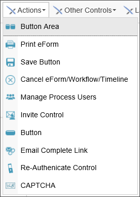
The controls in this section include the various Picker controls that enable users to pick various Process Director objects from the Form.
All Picker controls incorporate type-ahead selection rather than selecting from a pop-up list, dropdown, or listbox. You can begin to type the name of a user, group, etc., and Process Director will display a dropdown that matches the value you type into the Picker control.

 Button Area
The Button Area enables you to specify where the result buttons will appear on the Form page, allowing the user to submit the Form. By default, result buttons always appear at the very bottom of the page, if no Button Area control exists. With a Button Area control, you can specify the location where the result buttons will appear.
We recommend as a best practice that, when creating a Form that uses a Routing Slip, you place the Routing Slip at the very bottom of the page, with a Button Area control above it. This will enable users to complete the Form without having to scroll to the bottom of the Routing Slip.
There are number of tabs for this controls Properties dialog, to enable you to individually configure each of the standard buttons that display on forms.

On the Properties tab, in addition to setting the Name of the control, just as you do with other controls, you have the ability to set the HTML tag that will contain the button area, such as an HTML DIV or SPAN tag by setting the Wrapper Tag property with the name of the tag, e.g. "div".
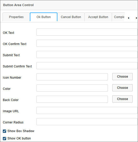
The OK Button, Cancel Button, and Accept Button tabs have similar properties for configuring each of the button types. The OK and Cancel buttons are standard buttons that appear on all forms. If the “Assign task to first user to accept” checkbox is checked on a Form instance’s step or Activity definition, the button area will first display an Accept Task button enabling the user to accept the task, in addition to the standard form buttons. Task completion buttons won't be displayed until the users accepts the task.
For Process Director v5.25 and higher, the OK button will be presented as a Submit button for new form instances. Both the OK and Submit Text and Confirm Text properties are configurable. If a Button Area control has no Submit Text property configured, the control will fall back to the OK Text property.
[Button] Text: The text that will appear on the button.
[Button] Confirm Text: The text that will appear to confirm the button selection when the button is clicked.
Icon Number: The ID number of any icon that you'd like to appear as a button icon. The Choose button will open the Icon Chooser to select the desired icon and color, or no icon.
Color: The text color for the button, which can be any valid HTML color value. The Choose button will open the Select Color dialog box to select the desired color.
Back Color: The background color of the button. The Choose button will open the Select Color dialog box to select the desired color.
Image URL: If you'd like to use an image, instead of an icon (or text) you can enter the URL of the image to display on the button.
Corner Radius: The text box will accept the percentage (e.g., "5%")or pixel (e.g., "10px") measurement for rounding the button's corners.
Show Box Shadow: This checkbox enables you to show or hide the button's shadow, to change the button's appearance from a 3D to a flat display.
Show [Button] Button: This checkbox enables you to show or hide the button on the Form.
The Corner Radius and Show Box Shadow properties were implemented in v6.1.300.

On the Complete Buttons tab, you have a Complete Confirm Text property that enables you to set the confirmation text when a task completion button is clicked. You also have a Show Task Complete buttons property to show or hide the completion buttons.
The Button Area control also automatically incorporates Form Info String and Form Error String controls, which enables the appropriate form information to display adjacent to the button area when applicable. You can override where the form error text displays, however, by manually placing a Form Error String control in the desired location on the Form.
 Print Form Button
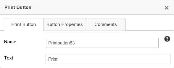
The Print Button control is a regular print button that will print the Form when clicked.
The Text property configures the text label you'd like to appear on the button.
 Save Button
By default, Process Director does not save a Form until the Form is submitted. The Save Button enables you to save a Form as an interim version until the Form is submitted. The field values will be saved in the interim version, and you can open the Form at a later time to complete your editing, and submit the form when you're done, which will save the Form in it's final version. Saved Forms will also appear in your Task List, to remind you to complete and submit them.
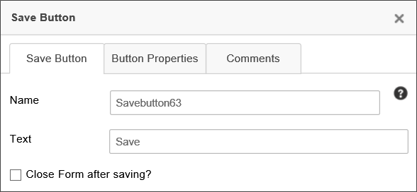
The Text property configures the text label you'd like to appear on the button.
Checking the Close Form after saving property will close the Form, while keeping it unchecked will save the Form without closing it.
By default, the Save Buttonisn't visible on new form instances. If you want users to be able to save the form on new form instances you must both:
- Select the Close Form After Saving property. Form instances can't be created in the database until the form is submitted to the server. So the button can't appear on new form instances unless the form is submitted on save. If you don't select this property, the Save Form button won't appear.
- In the field properties for the control, on the Form Controls tab of the form definition, you must set a visibility condition to make the control visible when New Form Instance? = Yes.

 Cancel Form/Workflow/Timeline
The Cancel Process button immediately cancels the operation of a Form or process. The cancellation can't be rescinded.
 There is no "Undo" feature for this action! BP Logix recommends this control be used only in Forms that are accessed by administrators, to be used for administrative purposes.
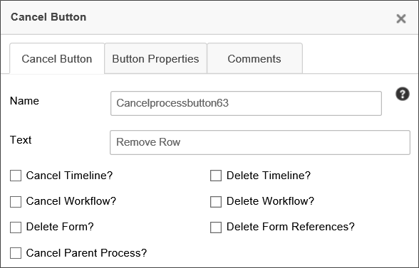
Several properties will enable you to cancel or delete process and Form instances. These properties can be used alone or in conjunction with others. Once the button is invoked, the results are irrevocable.
BP Logix strongly suggests that this button be used only in Forms that are used by administrators for system management. Extreme care must be taken to ensure that invoking this button does not cause unwanted effects, or place processes in an unrecoverable error state. Exhaustive testing should be performed in a development environment before deploying any Form that uses the Cancel Button to your production environment.
|
PROPERTY |
DESCRIPTION |
|---|---|
|
Name |
The name of the control |
|
Text |
Enables you to specify the text label that is displayed on the button. |
| Cancel Timeline? | Cancels the running Process Timeline instance. If this control is displayed in a parent process, this will also cancel all associated subprocesses. |
| Delete Timeline? | Cancels the running Process Timeline instance and then delete it from the system. |
| Cancel Workflow? | Cancels the running Workflow instance. If this control is displayed in a parent process, this will also cancel all associated subprocesses. |
| Delete Workflow? | Cancels the running Workflow instance and then delete it from the system. |
| Delete Form? | Deletes the current Form instance from the system. Deleting the Form without deleting the associated process will create an orphaned process instance, which may place the process in an unrecoverable error state. |
| Delete Form References? | Deletes all document attachments or other references for the current Form instance from the system. |
| Cancel Parent Process? | If invoked in a subprocess, cancels the subprocess' parent process. If the subprocess was invoked synchronously, it will also cancel the running subprocess. |
 Manage Process Users
This control enables a user to delegate tasks to other users, remove users from tasks, and perform other process management functions without going to the process’ administrator’s page.
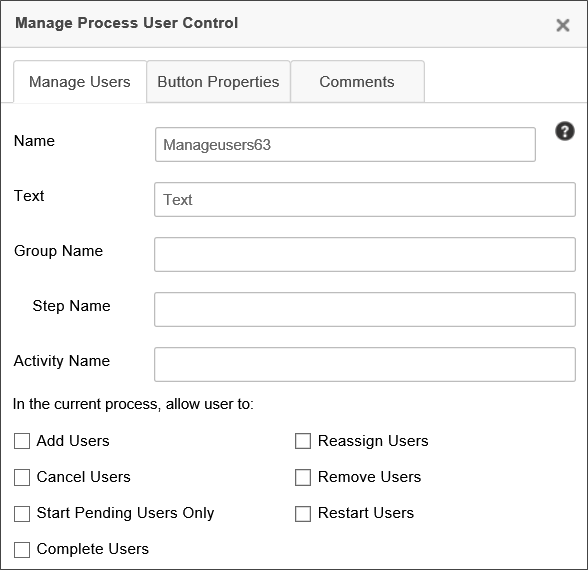
The Manage Users tab of the properties window for this control allows you to set the name, button text, and group name for the control. You can also specify what features the Form user is allowed to access.
|
PROPERTY |
DESCRIPTION |
|---|---|
|
Name |
The name of the control |
|
Text |
Replaces the default text on the control's button. |
|
Group Name |
The name of Process Director user groups from which the users will be displayed. This is useful to restrict the users that can be selected. The Group(s) can be specified as a group name or a system variable that returns a group name. |
|
Step Name/Activity Name |
The name of the step or Activity, in which you wish the control to appear. If left blank, the control will appear in all steps/activities. You can enter multiple Activity names, separated by commas. |
|
Add Users |
Checking this property will enable the user to add new users to a task. |
|
Cancel Users |
Checking this property will enable the user to cancel users in a task. |
|
Start Pending Users Only |
Checking this property will enable the user to start any pending task users. |
|
Complete Users |
Checking this property will enable the user to complete the user task. |
|
Reassign Users |
Checking this property will enable the user to reassign users to a task. |
|
Remove Users |
Checking this property will enable the user to remove users from a task. |
| Restart Users | Checking this property will enable the user to restart the task users. |
The Button Properties tab allows you to configure the URL of the button image and the style of the button, as well as the behavior upon clicking the button. These property are the standard button formatting properties that appear in the Button Properties tab of the Button control.
 Invite
The Invite control allows a user to invite other users in Process Director to a task. The inciter can select to add the invitees to perform the task with the inciter, or to reassign the task from the inviter to the invitee.
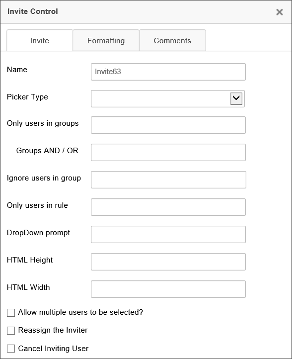
The Invite tab contains a number of options to configure the Form control.
|
PROPERTY |
DESCRIPTION |
|---|---|
|
Name |
The name of the control |
|
Text |
Replaces the default text on the picker's button ("…"). |
|
Picker Type |
Determines whether the user picker will show as a pop-up dialog box, or a dropdown control. |
|
Only user in groups |
The name of Process Director user groups from which the users will be displayed. This is useful to restrict the users that can be selected. |
|
Ignore users in group |
The name of Process Director user groups from which the users won't be displayed. |
|
Dropdown Prompt |
A brief prompt message that will appear in the dropdown, if the Dropdown picker type is selected. |
|
HTML Height |
The desired height of the control in pixels. |
|
HTML Width |
The desired width of the control in pixels. |
|
Cancel Inviting User? |
Checking this box will remove the task from the user's Task List when others are invited. |
|
Allow multiple users to be selected? |
Allows more than one user to be invited. |
|
Reassign the inviter? |
Reassigns the task to the inviter. |
When using the system variable syntax for this control, the system variable will return all of the formatting options for a user system variable.
 Button Control
The Button control places a configurable button control on the Form. The actions associated with the button control can be set in the Form Definition's Custom Task Event Mapping, Set Form Data or Fill Dropdowns tab. There are two tabs that can be configured to specify the properties of the control
Button Tab
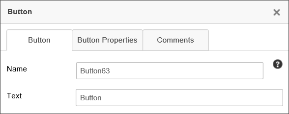
The Name property specifies the name of the control.
The Text property configures the text label you'd like to appear on the button.
Button Properties Tab
This tab enables you to configure additional properties for the Attach button.
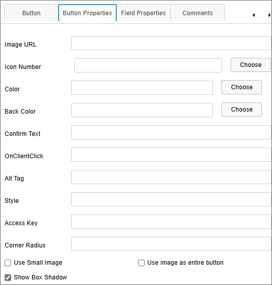
Image URL: The button can be displayed as an image by providing an accessible image URL to display instead of a standard button. This property will override other button properties below, e.g., Back Color.
Icon Number: You can select an Icon to display on the button from the Icon Chooser.
Color: You can select the text color to display on the button from the Select Color dialog box.
Back Color: You can select the background color to display on the button from the Select Color dialog box.
Confirm Text: You can specify confirmation text that will appear as a confirmation dialog box when the button is clicked.
onClientClick: You can specify client-side JavaScript to run on the button's onClientClick event.
Alt Tag: You can specify an ALT tag property for accessibility purposes.
Style: For Process Director v6.1.400 and higher, CSS style attributes can be applied to the button control.
Access Key: You can specify the accessibility keys a user can press to activate the button, for accessibility purposes.
Corner Radius: For Process Director v6.1.400 and higher, a CSS corner radius can be applied to buttons to display with rounded corners. The corner radius can be supplied in Pixels, REM, or percentages, e.g., 10px, 0.3rem, etc.
Use Small Image?: If you supply an image URL, the image can be displayed as an icon for the button by checking this property.
Use Image as entire button?: You can use the image as the displayed button, rather than displaying a traditional button on the form.
Show Box Shadow: This property, when checked, will display the button with the traditional, 3-D, raised effect. When unchecked, the button will be displayed using modern, flat design.
 Email Complete Link
This control provides a completion link for users to click in an Email Template so that they can complete their assigned task.
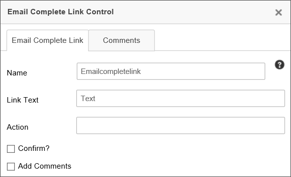
The Link Text property enables you to specify the text that will appear for the link, so that the user doesn't simply see the complicated URL that sends them to Process Director to complete their task.
The Action property enables you to specify the task action you want the user to perform. This action MUST match a result specified in the Results tab of the Timeline activity.
For more information on this control, see the section of this documentation entitled Complete Links in an Email.
 Re-Authenticate
For any Timeline Activity where the Re-Authenticate when a user completes the task option is checked, Process Director will add a user login to the Form. The Re-Authenticate control enables you to choose the location where you'd like the login box to appear on the Form, rather than allowing Process Director to insert it into the default location.
There are no configurable properties, other than the Name, for this control.
 Captcha
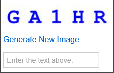
The Captcha control enables you to verify that a human submitted the form by placing a control that can't be manipulated by robots or scripts on a form. The Captcha requires that the person enter an alphanumeric code that appears in an image that is generated by the control. If the image doesn't match the text entered by the user, the form can't be submitted. When the form is displayed, and the user can't decipher the Captcha image, the user can regenerate a new image by clicking the Generate New Image link.
 To enable the Captcha functionality, you must set the Captcha field as required in the field's properties on the Form Controls tab of the Form Definition. When you do so, the user must enter text that matches the text displayed in the Captcha image, or the form won't validate and submit.
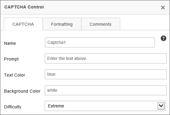
The Prompt property enables you to specify the prompt text to instruct the user how to fill out the Captcha.
The Text Color property specifies the text color to be used for the text in the Captcha image, while the Background Color specifies the background color of the image. You can use any HTML named color or HTML hexadecimal color representation for these values.
The Difficulty property specifies how easy the Captcha image will be to decipher. The following properties are available, along with a sample image of how each level of difficulty is represented in the Captcha.
|
DIFFICULTY |
Example |
|---|---|
| None |
|
|
Low |
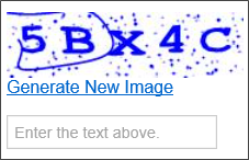
|
| Medium |
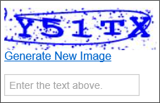
|
| High |
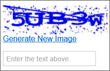
|
| Extreme |
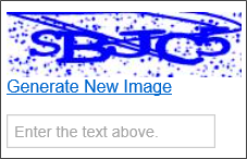
|
Other Control Tools
You can view the documentation for all tools available in the Online Form Designer by using the Table of Contents on the upper right corner of the page, or by clicking one of the links below.
Basic Controls: The most commonly-used form design tools.
Input Controls: Controls that are commonly used to collect data, but are a bit less widely used than the basic controls.
Other Input Controls: Additional Input controls, consisting mainly of the different content picker controls.
Other Controls: Controls that perform miscellaneous tasks like adding HTML content, or labels.
Layout: Controls that are used to govern the control layout for the template, such as tabs and sections.
Responsive Layout: Controls that implement Bootstrap form layout objects.
Arrays: Controls that enable to you create and control arrays on the Form.
Attachments: Controls that enable you to add and show attachments, such as documents or images, to the Form.
Data List (v6.0.100 and higher): Controls that enable the display of tabular data on a Form.
Form Control Tags: System Variables used to add controls to a Form, instead of using the UI controls.
Documentation Feedback and Questions
If you notice some way that this document can be improved, we're happy to hear your suggestions. Similarly, if you can't find an answer you're looking for, ask it via feedback. Simply click on the button below to provide us with your feedback or ask a question. Please remember, though, that not every issue can be addressed through documentation. So, if you have a specific technical issue with Process Director, please open a support ticket.

